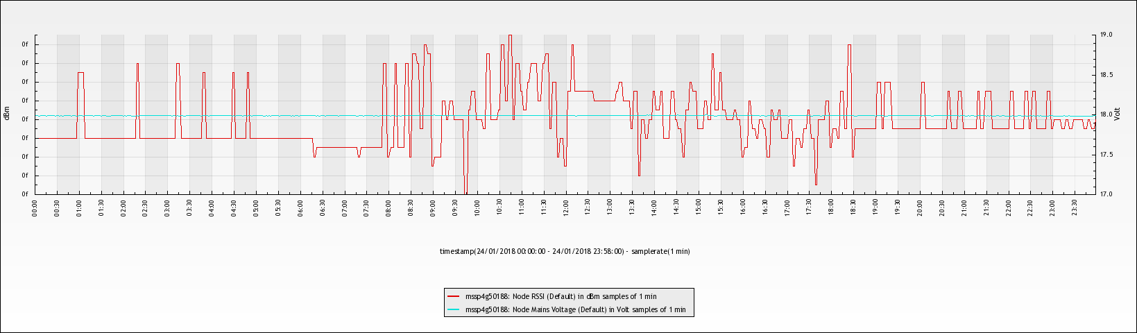
The Query page lets you plot a graph of the data you want to see. This image can be downloaded to your computer.
If you wish to plot percentiles have a look at our article: Show percentiles
Creating a simple graph
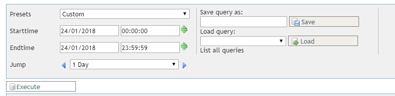
Follow these steps to create your first graph. We start by selecting the time period we want to plot in the graph. Multiple Presets are available to aid you in quickly selecting a time period (for example Today, Last 15 Minutes and Last Week).
You can save a Query you made (so you can quickly load it again another time) by entering a name in the Save query as field and pressing Save. You can load the query by looking at the dropdown options under Load query.
Next we need to specify what data to plot in the graph.
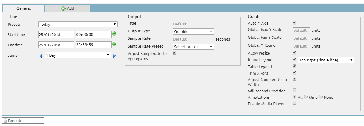
The Time selection is repeated here, if you already set it at the top you can leave it as is (it shows the same values). The other settings can be left to default.
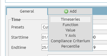
Select Add and Timeseries to add a new line to the graph.
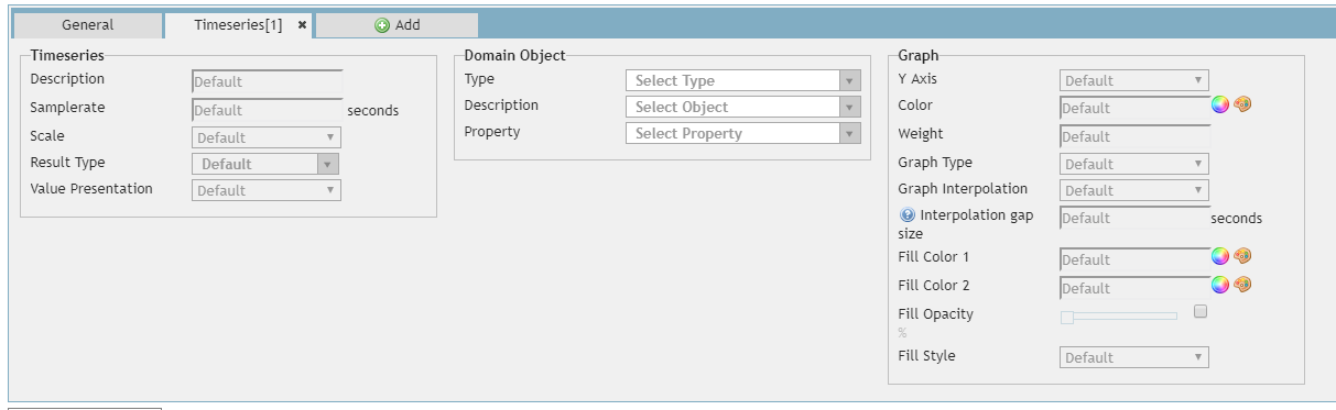
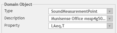
Under Domain Object we want to select the thing we want to display in the graph. Lets plot the LAeq of a Sound Measurement Point.
Type allows you to select the type of object to plot. In this case a SoundMeasurementPoint.
Description allows you to selecet the object to use. In this example a Sound Measurement Point called Munisense Office.
Property allows you to specify the data to plot of the object you have just selected. In this case LAeq,T
All this says is "plot the LAeq,T of the SoundMeasurementPoint called Munisense Office".
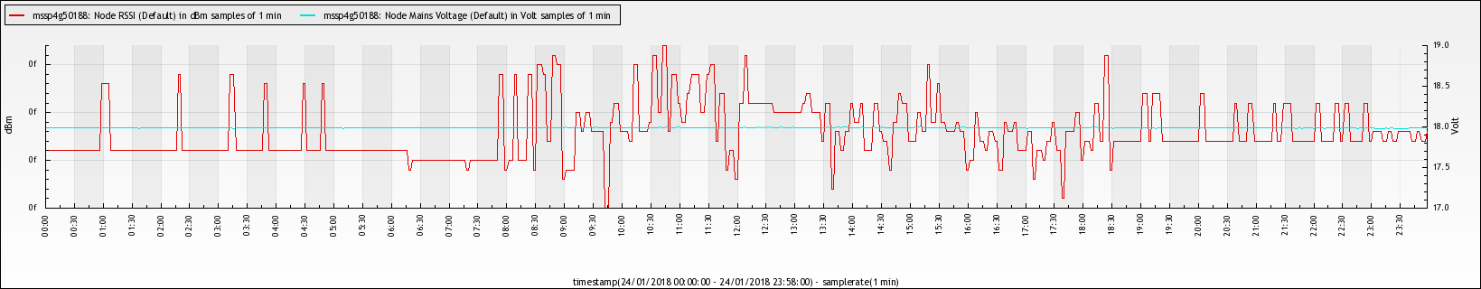
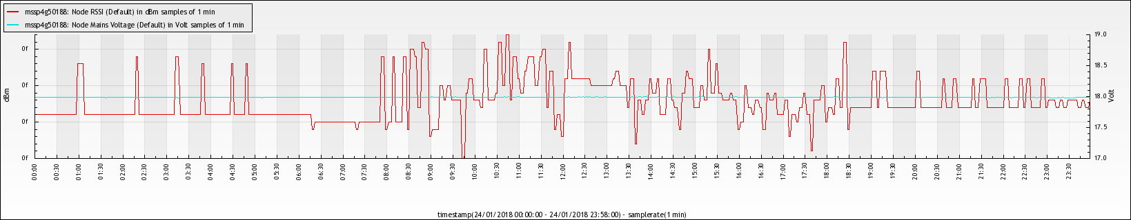
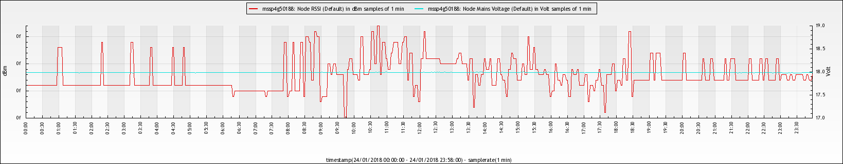
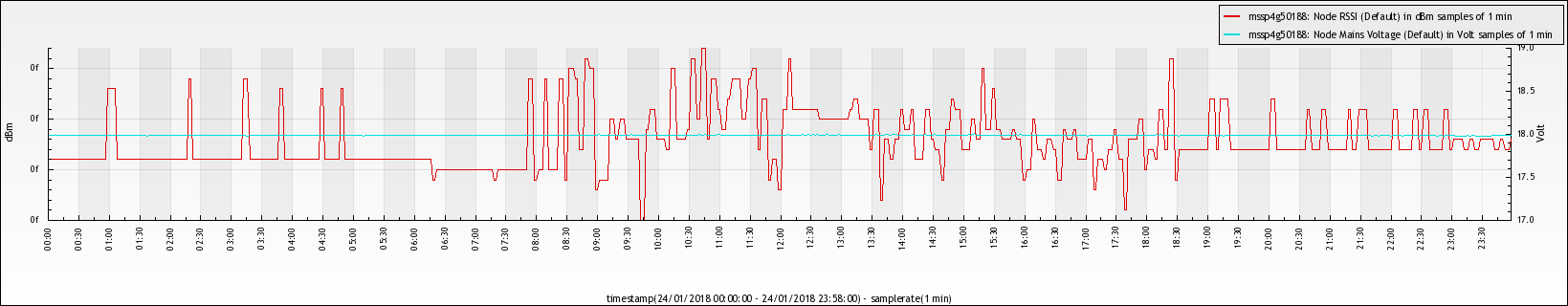
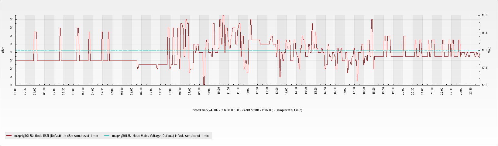
Finally we press Execute and we get a graph! This image can be downloaded by pressing the Save image button.
Save graphics query as template
The created query can be saved as a template so that you can simply edit the timeseries in the newly loaded query.
To create a template you fist have to create the query as setup above. After this you give the template a name under "Save Query As" and press save. The query can be loaded the same way by selecting it from the list and pressing "Load Query". 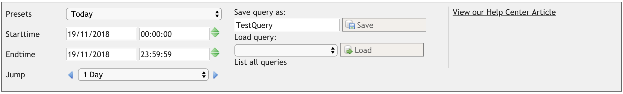
Inline legend options
The graph can show an inline legend, describing what the data means. This inline legend can also be disabled entirely.
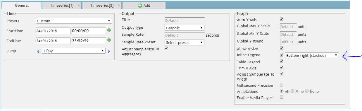
The following options are supported:
- Top Left (single line)
- Top Left (stacked)
- Top Center (single line)
- Top Center (stacked)
- Top Right (single line)
- Top Right (stacked)
- Bottom Left (single line)
- Bottom Left (stacked)
- Bottom Center (single line)
- Bottom Center (stacked)
- Bottom Right (single line)
- Bottom Right (stacked)
0 Comments